
TinyTales
5-Day Design Sprint: Quick Solutions for Parents to Easily Find the Perfect Bedtime Stories

Project Overview
about: TinyTales is a tablet app designed to provide a curated library of children's stories submitted by authors, aimed at parents looking for engaging read-aloud options for their kids aged 4-9.
The sprint aimed to simplify the process of discovering books and stories, making it quicker and easier for parents to find quality content to share with their children.
Team: solo project under the mentorship of Angelo Presti
Tools Used: Figma
Project Name: TinyTales Design Sprint
Duration: Aug 2024 (5 days)
Role: UX Design, UI Research, Product Design
The Design Brief
Problem
Parents of young children often struggle to find appropriate and engaging stories to read aloud to their kids on the TinyTales tablet app. Despite the app's extensive library of children's stories, the process of selecting the right book is time-consuming and frustrating. The current categorization system doesn't adequately reflect the specific needs of parents, making it difficult for them to quickly find stories that match their child's reading level and interests.
Project Goal
This project aims to reduce the friction of finding the right story by finding solutions to effectively categorize and present books to parents.
Solution
The proposed solution is an effectively organized screen that easily categorizes books by reading level and provides preview and summary of screens.
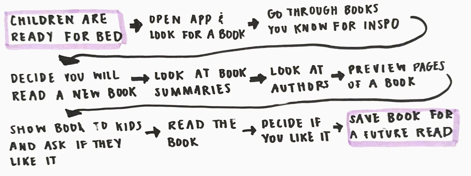
Day 1: Map
To get a better understanding of the journey parents may have while trying to find a story to read to their child before bedtime, a map of the possible end-to-end user experience was made:
Day 2: Sprint
Lightning Demo: the lightning demo was used to generate ideas from applications that could be applied to find a solution for selecting the right book with ease.

Inspiration 1: Pinterest - “More to Explore” section
This feature applied to TinyTales would allow parents to discover books within the same genre. For parents who enjoy exploring a specific topic, it helps them easily find the perfect story that fits their interests.

Inspiration 4: Ahead - Profile for each child
This feature would hypothetically provide story suggestions tailored to the parent and child, based on factors like reading level, genre, academic relevance, and author. It helps parents avoid decision fatigue by offering a readily available, relevant option for bedtime stories.

Inspiration 2: Moonly - Daily Recommendations
This feature would hypothetically provide story suggestions tailored to the parent and child, based on factors like reading level, genre, academic relevance, and author. It helps parents avoid decision fatigue by offering a readily available, relevant option for bedtime stories.

Inspiration 5: Spotify - Preview Section
A common challenge for parents is finding stories that match their child's reading level. Organizing and categorizing stories by reading level simplifies the process, making choosing the right story for their children easier.

Inspiration 3: Ahead - Separation by Levels.
A common challenge for parents is finding stories that match their child's reading level. Organizing and categorizing stories by reading level simplifies the process, making it easier to choose the right story for their children.

Inspiration 6: Scholastic Website - Collections.
Different curated collections of books can be made so that parents can find books relevant to what they want to expose to their child.
Crazy 8s were made to sketch out all of the ideas brainstormed during the lightning demo. The lightning demo inspired a wide range of design solutions such as book of the day, categorizing books by levels, preview screens, and book collections.


The preview screen was identified as most crucial, addressing a key user pain point: parents spending excessive time selecting books. It offers an overview and preview pages, allowing users to quickly assess a book before reading. This screen best showcased essential categorization features among all the sketched ideas.
The solution sketch aimed to illustrate how the preview section would appear within a user flow. The first screen starts with the home page, showcasing various ways users can narrow their book search. The second screen provides a detailed view of the book preview, featuring a three-page sample. The final screen represents the end of the user journey: reading the book.
Day 3: Decide

When drafting the panel storyboard, I focused on addressing the primary pain point: effective categorization and book previews.
My solution sketch outlined a user flow starting with categorization, followed by previews to help parents assess the books length, level, and tone.
By emphasizing the books reading level, topic, and essential information upfront, the screens in the storyboard captured critical user journey steps aligned with core research insights.
Day 4: Prototype

The preview section, showing pages from different parts of the story, directly addresses the feedback from parents who wanted a quick way to evaluate a book’s suitability. This approach provides a comprehensive overview, enabling parents to make informed decisions without the need for time-consuming exploration.

I applied color to distinguish between different reading levels, for clear visual categorization. This choice was guided by the need to make it easier for parents to identify stories that match their child’s reading ability.
The slide able category selector at the bottom of the screen was designed to address preferences of all users. User research revealed parents have varied preferences—some seek books with educational value, while others prioritize topics their children are currently fascinated by—the selector offers a broad range of categories.
To further make the levels a way in which users can filter which books to read to their children, the search filter easily allows parents to search based off of the reading level.


Including detailed descriptions of each reading level was an intentional strategy to provide clear guidance and support. Knowing that parents value expert recommendations, I designed this feature to serve as a trusted reference, helping them confidently select stories that are well-suited to their child’s reading level and interests. This reduces the effort required in finding the right story, enhancing the overall user experience.
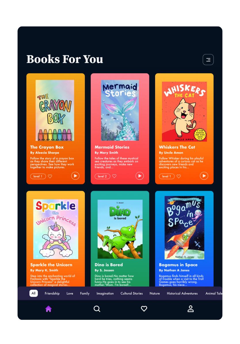
Final Prototype
Day 5: Test
Participants
Summary of findings
When selecting participants, I prioritized parents who value bedtime reading, adding a babysitter for diverse insights.
Prototyping testing showed that categorizing books by reading level effectively addressed key pain points. Participants appreciated the app’s filter section and the ability to sort by various categories, which made book selection easier. However, the absence of certain CTA buttons made the experience less intuitive. Additional research, enhanced iconography, and clearer distinctions could further improve the accuracy and usability of the reading level feature.
Findings:
1: Color coding by reading level was clear to users, helping them easily distinguish books.
2: The preview section lacked intuitiveness; adding arrows and guided CTA buttons could enhance usability.
3: The play page lacked intuitiveness, horizontal scrolling would mimic the real-world feel of a book
Ref lection
Speed and Efficiency in Problem-Solving: I learned the impact of quickly generating solutions in a short sprint, revealing valuable insights in just five days.
Value of Lightning Demos: I discovered how lightning demos could spark a diverse range of creative solutions, fueling a rich ideation process.
User-Centric Decision-Making: I rooted every decision in understanding user needs, ensuring that narrowed ideas and solutions aligned directly with user priorities.
Rapid Concept Validation: I focused on fast feedback to validate the concept’s potential, establishing a clear foundation for deeper, more refined design iterations.