
VibeVerse
Converting users from a freemium model to a premium model by providing an enhanced user experience through sociability and exclusivity
Project Overview
Prompt
A startup company launched a media product, employing a freemium model. The company’s initial strategy was to build a user base with a free product and later introduce a premium version with advanced features to generate revenue. With a healthy base of free users established, the company is now focusing on designing a user experience that encourages users to subscribe and pay a monthly fee.
Team
solo project under the mentorship of Angelo Presti
Tools Used
Miro, Excel, Figma, Adobe Suite
Project Name
VibeVerse
Role:
UX Design, UX Research, Branding, Product Design
The Design Brief
Problem
The company needs to design a user experience that effectively converts free users into paid subscribers for its media product, leveraging the established freemium model to drive revenue growth.
Project Goal
The goal is to design a digital media experience that effectively guides users toward a premium offering
Solution
The freemium model creates an engaging social experience for users, encouraging them to start with the free version. For those actively using the app, the premium model introduces exclusive features—such as access to artists' concerts and enhanced capabilities—that provide additional value. By offering unique, premium-only benefits and limiting certain features in the free model, users are motivated to upgrade to access a fuller, richer experience.
Research
In-depth user interviews were conducted to uncover key reasons why users would want to convert from a free model to a paid model. The target users included individuals aged 18-30 who are budget-conscious and highly engaged with media, with varying levels of impulsivity, risk tolerance, and decision-making styles that impact their subscription behavior.
Here are some key insights from the interviews:
1
Users perceive greater value when premium services offer exclusivity
2
Social influence and the desire for shared experiences play a crucial role in shaping user engagement and media consumption choices
3
Users highly value algorithms that understand and anticipate their needs and interests in real-time
Ideation
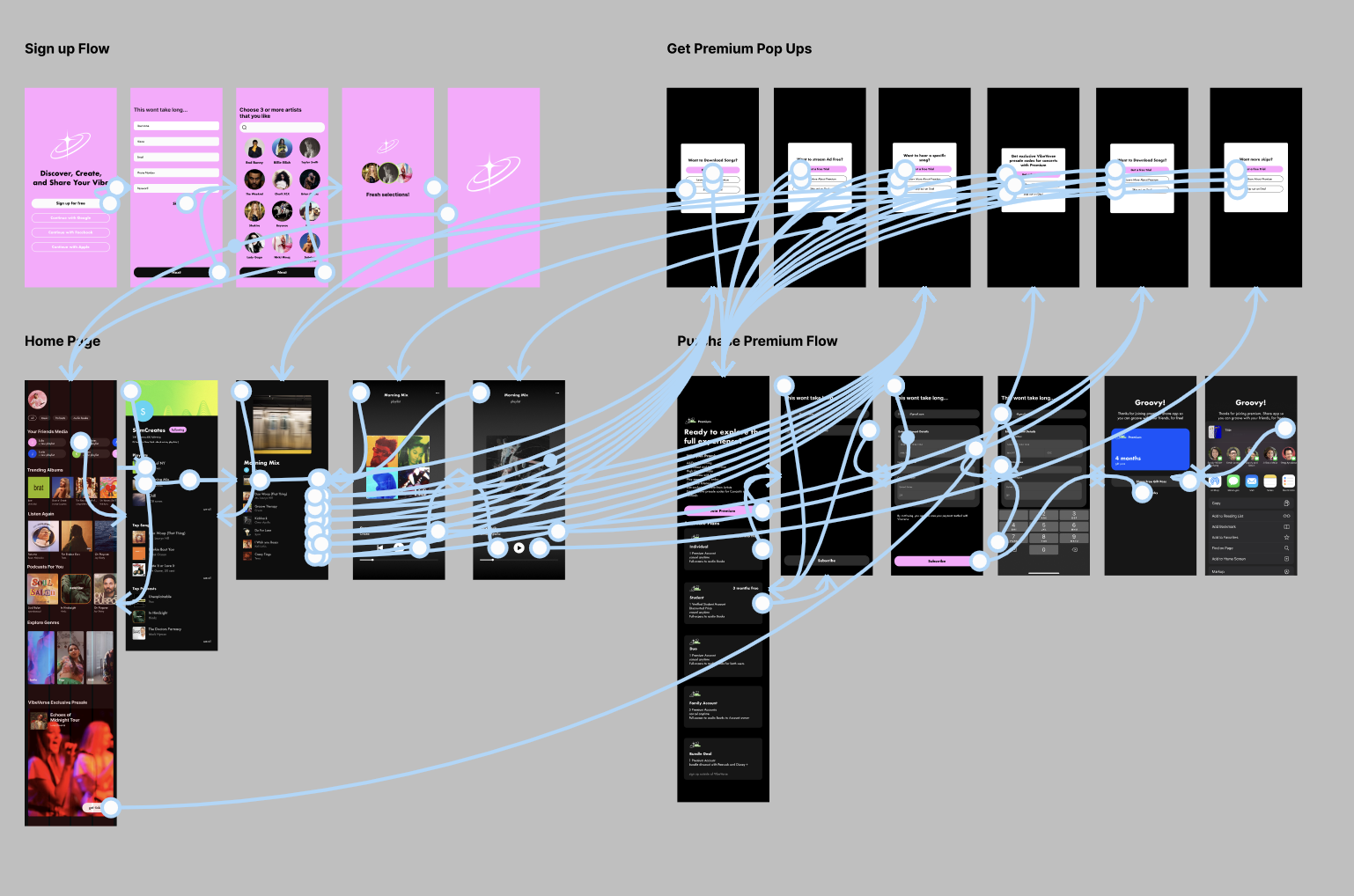
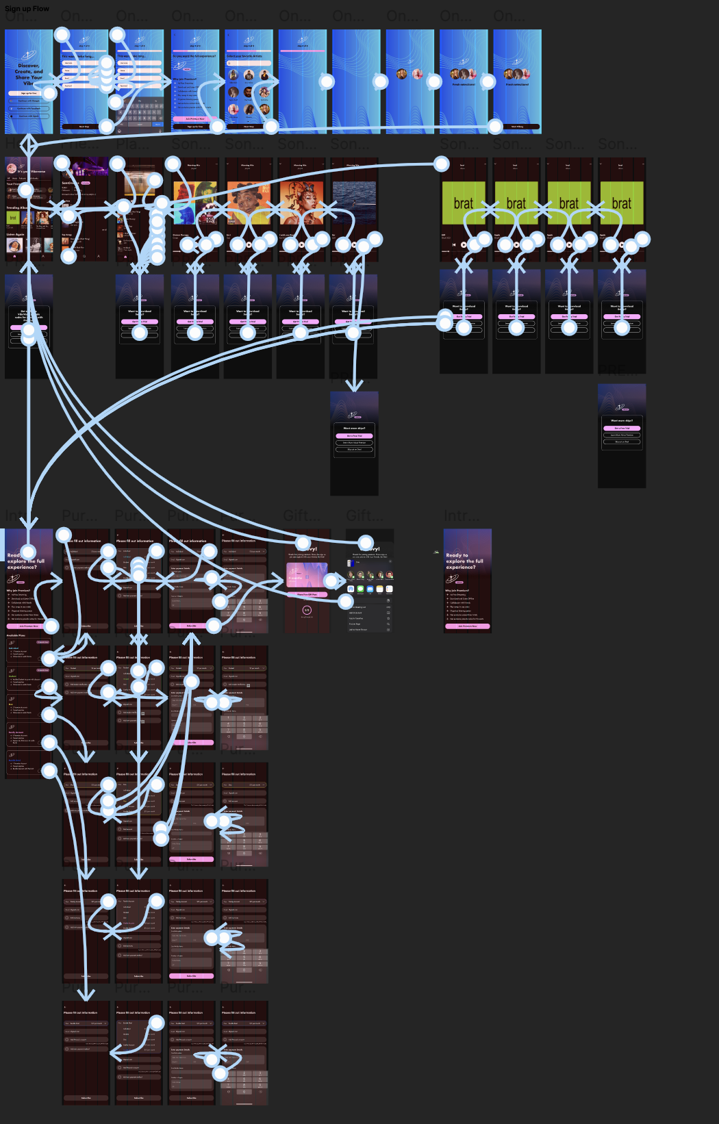
User flow: Finding ways for users to convert


The user flow was developed following a competitive analysis of top streaming brands such as Spotify, Pandora, Apple music, and Youtube to understand their strategies for encouraging users to upgrade to the premium model.
Mood Board
Branding

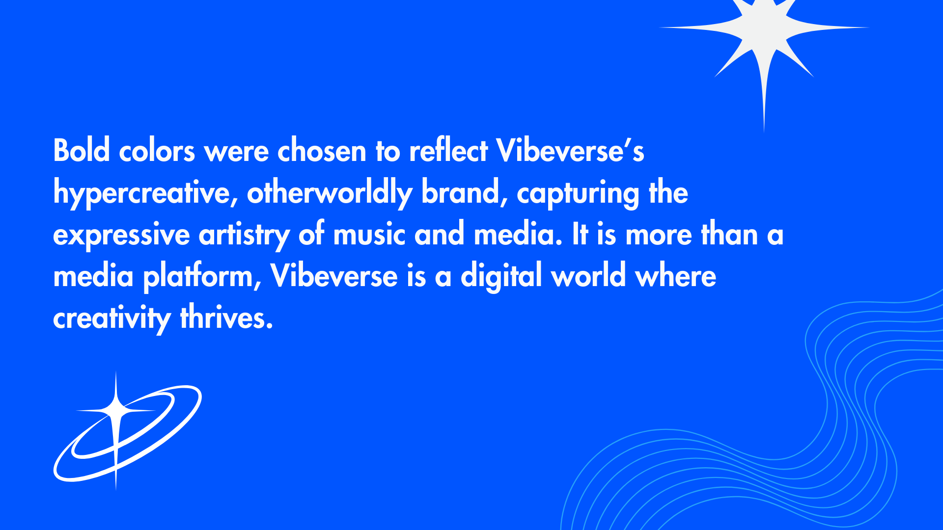


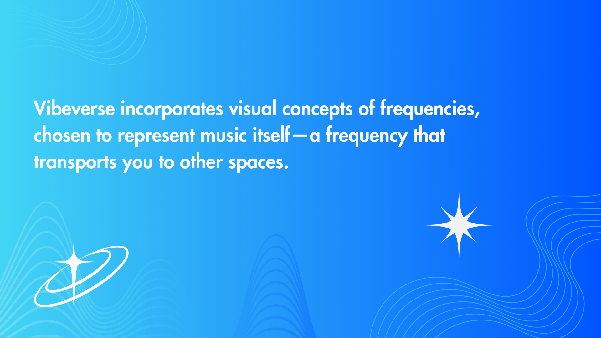
Style Guide

Low-Fidelity Prototype
Identifying key motivations for users to join premium early in the design process
The first low-fidelity prototype was tested to determine if the flows effectively encouraged users to onboard the premium version. This testing provided insights into features that motivated users to use the app and upgrade to premium.
Low Fidelity Testing
Interview Details
1:1 interviews were conducted via Zoom and in person.
Insights
Interactivity and Engagement: Users appreciate interactive elements and animations that make the app feel dynamic and engaging. Visual movement captures their attention and encourages exploration, creating a more immersive experience.
Unexpected Pop-up: Users were surprised to see the pop-up for premium screens
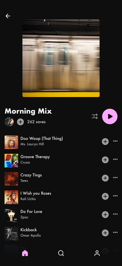
Social and Community Features: The community-oriented features, particularly the ability to view friends' activity, were well-received. Participants noted that seeing their friends’ playlists inspired them to engage more and share their own music tastes, enhancing the app’s social appeal.
Payment Process and Trust: Trust in the payment process was mixed. While some users felt reassured by the professional and high-quality appearance of the app, others expressed skepticism due to a lack of detailed information about the cost. Providing additional details about premium costs could help reinforce trust in a subscription.
Opportunities
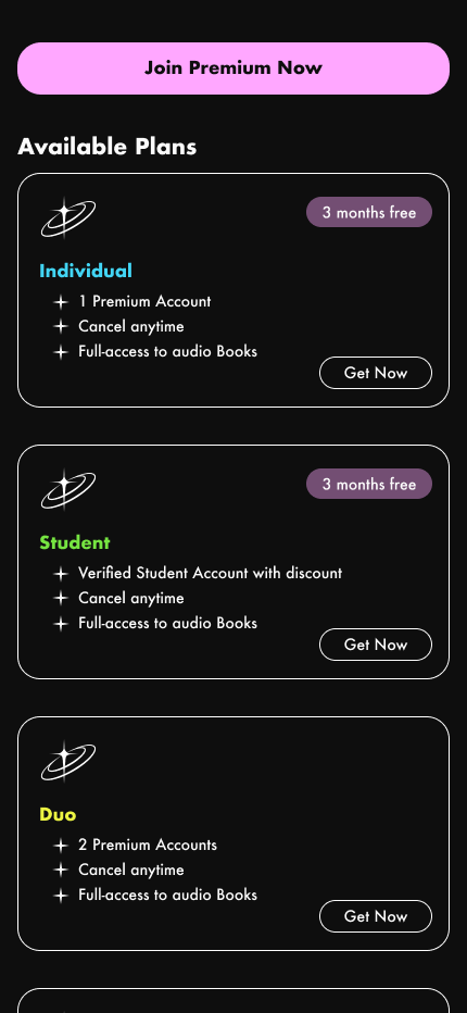
Enhanced Premium Onboarding: Offer a more comprehensive onboarding for premium subscriptions, including detailed information about the cost of each premium tier.
Immersive Visual Experience: Incorporate stronger visuals and animations to enhance the immersive experience, encouraging more users to sign up for premium versions.
Personalized Profile Customization: Increase profile customization options by allowing users to personalize profile and banner images, reinforcing the social and personalization aspects of the app and encouraging continued use.
First Test Iterations
Iteration 1: Premium option revealed during the onboarding process
To ensure users are aware they’re on a freemium plan, the option to sign up for premium was added to the onboarding process, preventing surprises when features are limited.
Before

Before
After


Iteration 2: Seamless and Informative Premium Onboarding
Testing revealed skepticism about paying for premium due to a lack of detailed information about the cost. Screens were updated to provide a seamless and informative dropdown with the cost of the different premium options.
After
High-Fidelity Prototype
High Fidelity Testing
Interview Details
1:1 interviews conducted via Zoom and in person.
Insights
Unmet Expectations for Social Features: Participants showed interest in the app’s social potential but felt the social component was limited. Users were more curious about the social engagement features and felt that they were apparent but limited
Confusion in Premium Sign-Up Process: All users encountered difficulties in the premium sign-up flow, particularly with a disabled button that appeared clickable. This confusion interrupted their journey and diminished the ease of completing the upgrade, highlighting a critical area for refinement in the user experience.
Appealing Visuals Enhance Engagement: The vibrant colors and interactive animations consistently drew users in, making the app feel engaging and visually attractive. This strong positive response to visuals underscores the value of maintaining a high level of design polish in future updates.
Opportunities
Strengthen Social Features and Onboarding for Premium Appeal: To leverage the social component as a differentiator, introduce additional social features and an onboarding sequence that showcases these capabilities. Clear demonstrations of the social features could help users see the added value in upgrading to premium.
Refine Visual Indicators for Button States: Redesign disabled buttons to appear distinctly inactive, using color cues or iconography to clarify their status. This visual distinction would prevent user frustration and ensure smoother navigation, particularly in key flows like the premium upgrade.
Guide Users with Clear CTAs in Payment Flow: Add a responsive call-to-action that guides users toward the correct steps in the premium sign-up flow, especially if they try to interact with a disabled element. This would provide immediate feedback, helping users complete the process without unnecessary detours and enhancing conversion rates.
High Fidelity Iterations
Iteration 2: Strengthen Social Features and Onboarding for Premium Appeal
Testing participants expressed a desire among to better understand the app’s social features before deciding to upgrade to premium. To enhance the social component, additional sections were added to the Profile pages.
Before

Before

After


Iteration 2: Refine Visual Indicators for Button States and Guide Users with Clear CTAs in Payment Flow
All testing participants encountered a critical issue in the final stage: confusion with the premium sign-up process due to a disabled button that appeared clickable. TThe iteration resolves this by clearly indicating disabled buttons and guiding users to the appropriate CTA for payment information if they attempt to click.
After
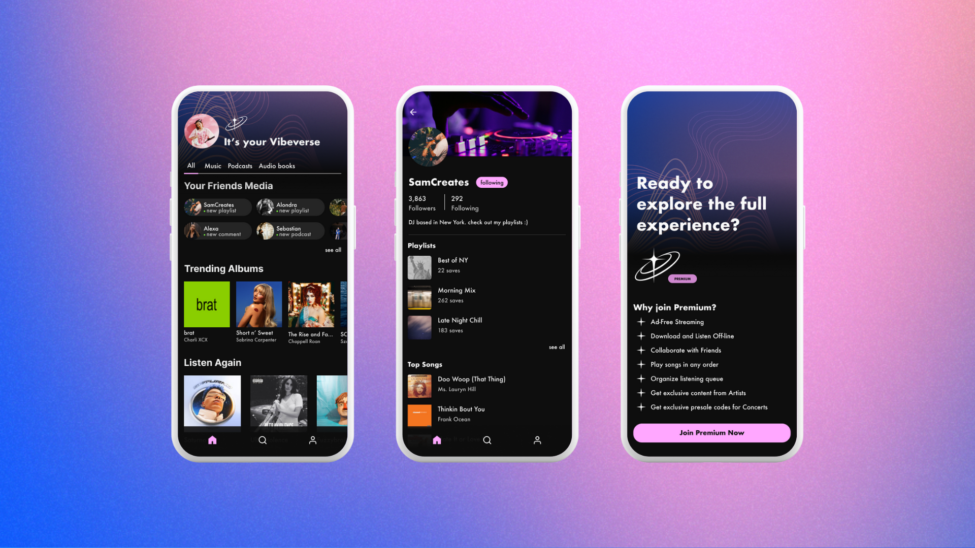
Key Features


Key Feature 2: Gift Card Option Post Sign-Up
To grow the premium user base, VibeVerse offers a limited-share gift card with an extended free trial, rewarding users for joining and encouraging them to share with friends.
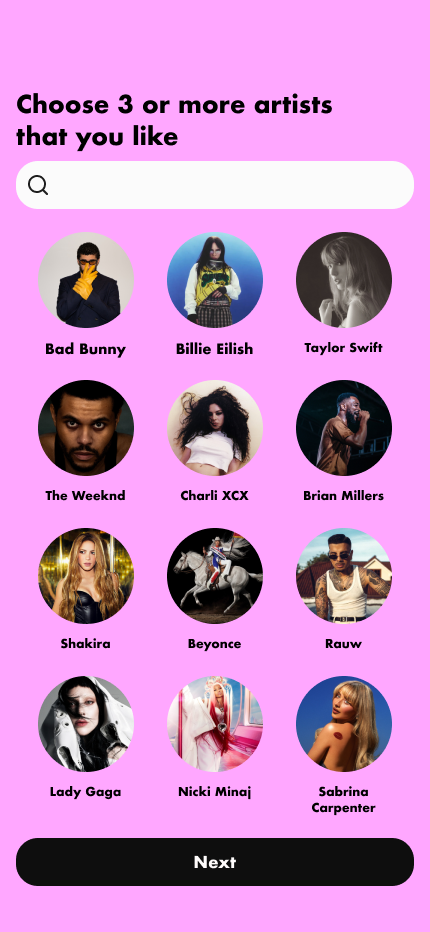
Key Feature 3: High Level of Sociability and Customization
User research showed that social influence and shared experiences drive media engagement. To support this, the app includes social features and customizable profile bios and banners, fostering personalization and social interaction to encourage ongoing usage.
Key Feature 4: Persistent "Get Premium" CTA
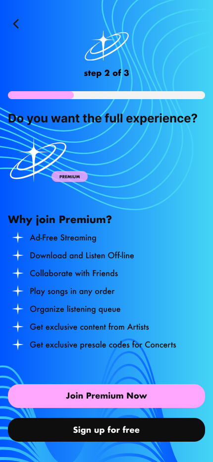
To highlight the limitations of the freemium version, "Get Premium" CTAs are strategically placed across multiple screens, ensuring users are aware of premium-exclusive features while still enjoying core functionality.
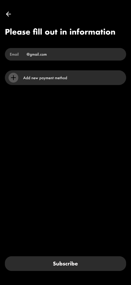
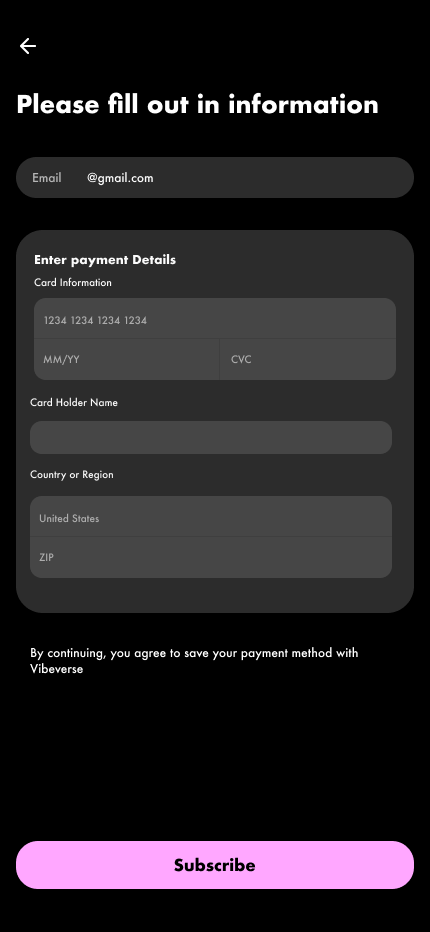
Key Feature 1: Clear Description of Premium Features and Plans
To ensure there was full understanding of what the premium features were for the user, a clearly detailed and concise list of the features was incorporated. The various premium plans were clearly distinguished and outlined so that users can easily understand the options and deals to encourage signing up.
Final Prototype
Ref lection
Critical Reflection
Importance of Early-Stage Testing: Testing early iterations saved significant time by informing key design decisions upfront. Delaying tests until high-fidelity stages would have required additional time for final adjustments.
Importance of Clarity in Button States and CTAs: This project underscored the importance of clear button states and intuitive CTAs. My experience observing participant confusion highlighted how crucial these elements are to a smooth user experience.
Key Reflection
Intersection between User Needs and Business Goals: This project emphasized the importance of aligning user needs with project objectives. With the goal of increasing premium sign-ups, testing revealed that prioritizing user needs and desires ultimately enhanced users’ willingness to upgrade.
Impact of Strong Branding, Visuals, and Animations: User feedback highlighted the significance of strong branding and engaging visuals. The appeal of these elements positively influenced users' interest in signing up for premium.